Category: 2D

Quick Mask in Photoshop

This post is a short but hopefully useful one.

Some of my friends/co-workers occasionally ask me about Photoshop tips. I’m not a gold mine of tips, but my former boss/friend/mentor back in Trinidad (Brett) taught me a few cool tricks in Photoshop over the years and they seem to be pretty useful to the web design crowd at times. (Brett is also a pretty good StarCraft player)

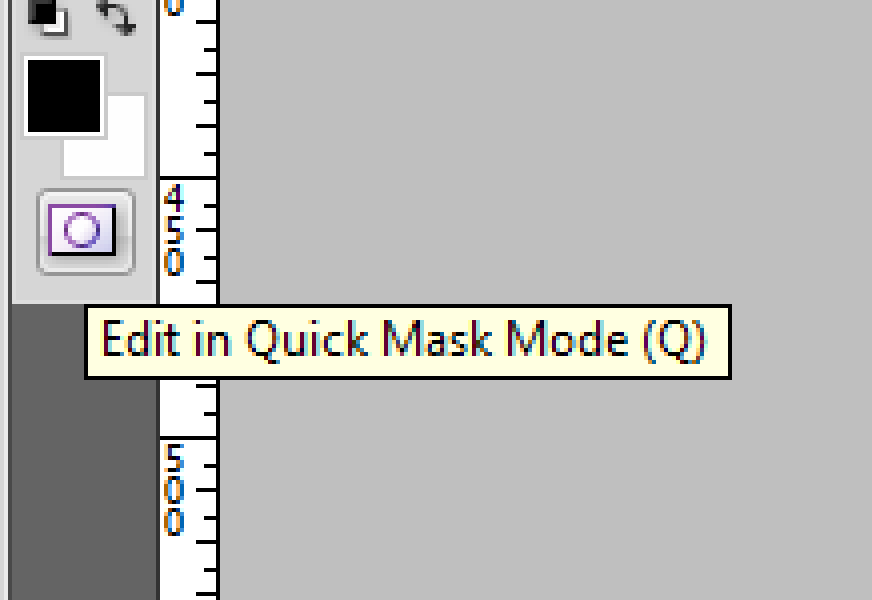
This tip is the extraction of a logo or symbol from a flattened image. Typically a user would use the Magic Wand tool or try to draw the selection by hand. In some circumstances however, there’s an easier way: Read More
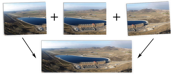
Installing & Using Hugin, Autopano, & Enblend on Windows

Putting it all together…

Panoramic images can be roughly defined as: A wide angle Photograph or Illustration. These images are not simply captured with a wide angle lens, but usually the term refers to the stitching together of a horizontal sequence of images to form an ultra wide angle view of a space or landscape. The great thing about these panoramas is that anyone with a digital or film camera can easily capture and stitch these images by following a few simple guidelines. Read More

PTViewer Tutorial – Publishing Panoramas

Publishing Java Based Panoramas With PTviewer

  • Click & drag the image to look around.
  • Use the + & – keys on your keyboard to zoom in or out.
  • Use Shift & Control to Zoom in & out while dragging.

Basic Formula

The code below shows the bare minimum code required to display a panoramic image in your web browser. (with the addition of the ‘auto’ parameter which makes the view rotate until the user clicks the image.) This code must be placed within the body tag of your HTML Document. Read More

Photoshop Tutorial – Lab Color & Tiling

The Typical Scenario

You’ve got a patch of grass, or a ceramic tile, and you need to use it as a pattern. You select the best section you can find, crop it into a nice manageable square, and when you tile it, you realize that the Luminance varies across the image and you’re not sure how to make it all even. Read More

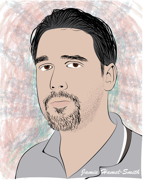
Illustrator Self Portrait

One of my more serious looks…

An exercise in brush strokes. A photo was used as a template, and I essentially traced the vital lines needed to create a convincing representation of my face. The hair and stubble was created with a series of custom brushes, and the background used some preset brushes, colored and layered.

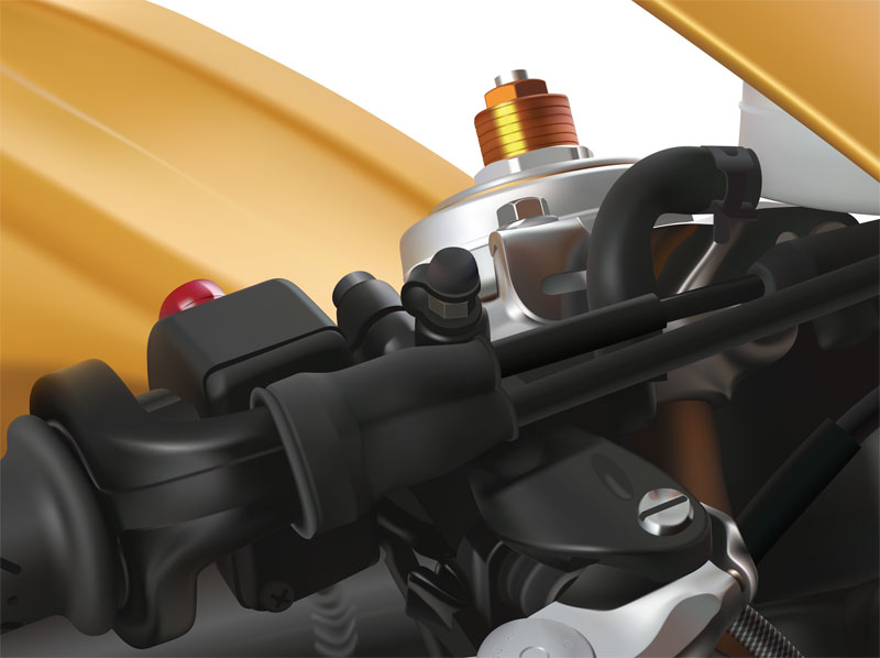
Triumph Daytona Poster

About The Bike

The Daytona 675 was an obsession of mine for some time, it’s simply one of the best 600cc Super-Sport motorcycles ever. In addition it has some of the raciest and most cutting edge details. If you’d like to add to the aforementioned, it’s British, so it’s also an underdog in the world of Sport Bikes with it’s only neighbours being the Italian giants.

About The Project

I chose to illustrate this bike for a class project dealing with gradients and blends. The goal of the project was to use a photograph as a template, and reproduce the underlying image using vectors, blends, and Adobe Illustrator’s Gradient Mesh Tool. Read More

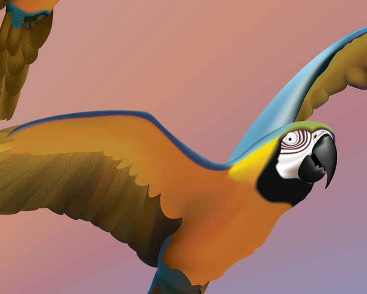
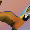
Macaws Poster

Poster for the San Deigo Zoo (class assignment) done in Adobe Illustrator using the Gradient Mesh Tool, Blends and Gradients.

Mastodon