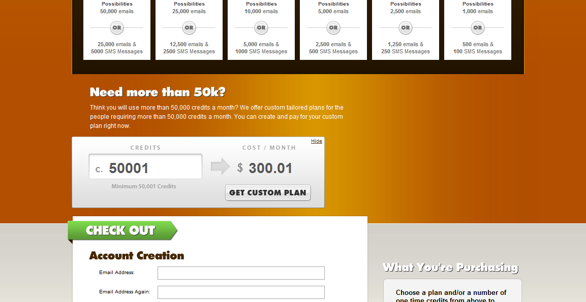
Here are two simple videos of the Champion Sound checkout process. I worked on several version of this site with my co-worker Matt Lackey at digital-telepathy. The “cart” logic was a focal point as the purchasing of credits was awkward. in the videos you’ll see a landing page and an upgrade page. The landing page was presented to users who were not logged in, while the upgrade page was for authenticated users.
Landing Page
This page is pretty basic in terms of functionality, but it was based on the page below. It was essentially an interaction-toned-down version that used a lot of the same markup.
Upgrade Page
This page was pretty exciting as Matt designed some cool layering highlights and sliding feedback. Essentially, when you entered a budget or quantity of credits in the fields; the yellow highlight indicated which monthly plan was most in-line with your needs.
